Welcome to the next chapter of Scrut! We’re thrilled to unveil our brand-new look, created with you in mind. Our revamped user experience will transform your compliance journey, making it more intuitive, efficient, and enjoyable. Here’s a sneak peek into what’s new and how these changes will benefit you.
Why the change?
At Scrut, we constantly strive to improve our platform to ensure it meets your needs. After gathering and reflecting on your feedback, we decided to simplify and enhance your interface with Scrut. Our goal was to create a platform that not only meets your needs but also makes your compliance journey as smooth and effective as possible.
Our guiding principle for this user experience revamp was “Simplicity.” We focused on cutting through the clutter to ensure that the tasks that matter most to you are front and center. The result? A cleaner, better organized, and visually appealing interface designed to help you get things done faster and more efficiently.
What’s New?
From simplified dashboards to streamlined navigation, we’ve made several significant enhancements to Scrut’s interface. Here’s a closer look at what’s new:
Simplified navigation
We’ve restructured the main menu (sidebar) for easier access. The modules are now grouped into logical buckets that simplify navigation for users. This means you can quickly find the tools and the information that you need without getting lost in a sea of icons. By organizing the menu in a more intuitive way, we’ve reduced the time and effort required to navigate through the platform. Plus, with primary Call-to-Actions (CTAs) now visible as tabs, you can access key features with fewer clicks.
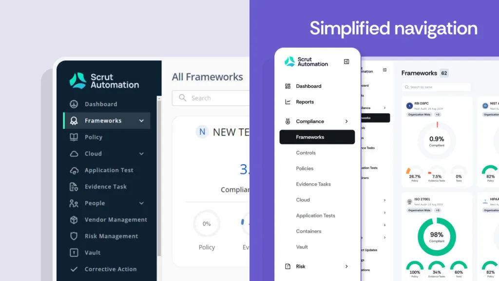
We’ve simplified the main menu by grouping modules into easy-to-navigate sections.
Modern design
The new interface features a clean, contemporary look with updated icons, softer edges, and a pleasant color scheme. This modern design is not just about aesthetics: it also enhances usability. The updated icons are easier to recognize, and the softer edges provide a more comfortable visual experience.
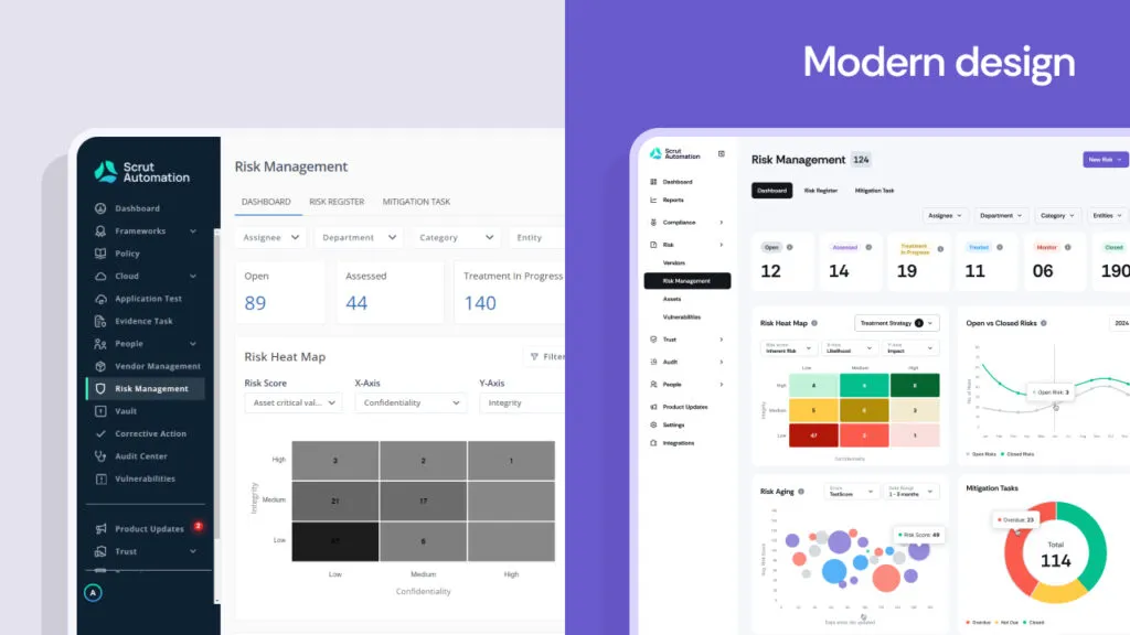
The interface now has a clean look with updated icons, softer edges, and pleasant colors.
Actionable dashboards
Users can now double down on each chart or graphic and automatically transition to the specific module to view a drill-down of that metric. This means your dashboards are not just for viewing data; they are interactive tools that provide deeper insights. With a single click, you can dive into the details behind the numbers, making it easier to understand and act on your data.
Each main module now has a dedicated dashboard, listing page, and expanded view, giving you a comprehensive understanding of your compliance status at a glance. We’ve also made data points clickable, allowing you to interact with specific pieces of data directly from your dashboard, enhancing both the efficiency and effectiveness of your data analysis.
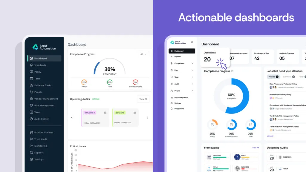
Users can now click on charts or graphics to dive into specific modules.
More flexibility
The new interface offers both list and grid view options to match your preferences. Since many users are accustomed to the grid view from Google Folders, we’ve included this option on our platform. Whether you prefer the visual layout of grids or the simplicity of lists, Scrut now adapts to your workflow, providing a customizable experience that suits your style.
Additionally, we’ve introduced category tags for integrations to help you find what you need and quickly identify relevant tools.
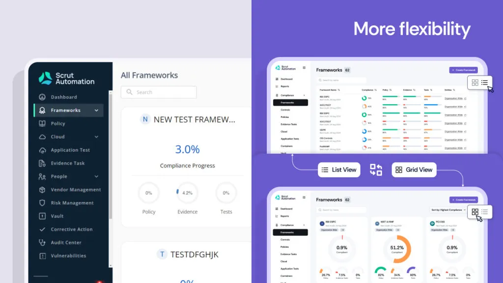
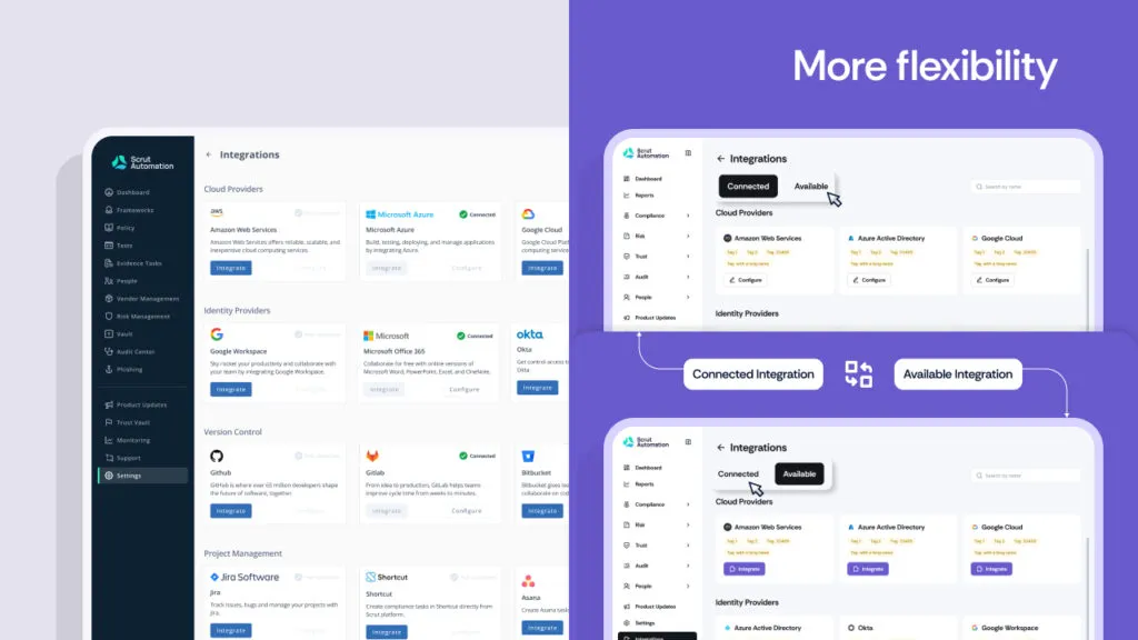
The new interface lets users choose different views, like grid or list, based on their preferences. Category tags for integrations make it easier to find and identify relevant tools.
Here’s how you’ll benefit
Our goal with these updates is to make your compliance journey smoother, faster, and more enjoyable. Here are the benefits of Scrut’s new makeover:

Our new color scheme resonates with users, communicating the value of our deep features and sparking engagement. It makes the information on the screen easier to understand and redirects attention to important tasks. The visual refresh is designed to reduce eye strain, making it easier to work for extended periods without discomfort.

Reduce time hunting and gain more productive hours with Scrut’s new dashboard. The new look serves as a compass, guiding your next steps and driving desired outcomes effortlessly. Intuitive card placements and guided navigation mean less effort in managing tasks and quicker completions.

With a more logical flow, you can move through your tasks with ease, reducing the time spent navigating the platform. By prioritizing the most important elements and removing unnecessary distractions, we’ve created a workspace that is both functional and visually appealing. This clean interface helps you focus on what matters most, increasing your productivity.

The updated interface is straightforward and easy to learn, getting you and your team up to speed in no time. The intuitive design ensures that new users can quickly understand and use the platform without extensive training. This means less time onboarding and more time achieving your compliance goals.
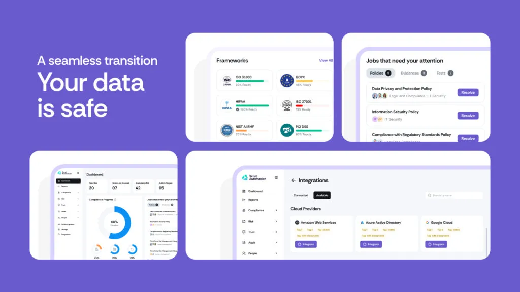
A seamless transition: Your data is safe
We understand if you have any concerns regarding your data during the transition. Rest assured, we’ve made sure that all your information will stay intact. You won’t lose any data, and the shift will be seamless. Your compliance processes will continue without a hitch.
Ready for change?
We’re incredibly proud of the new Scrut Platform and can’t wait for you to experience it. Dive in and explore the new interface—your compliance journey is about to get a whole lot easier!
Ready to see the new Scrut in action? Log in now and start exploring! If you have any feedback or need assistance, our team is here to help. Stay tuned for more updates and features coming your way soon. If you’d like to check out how Scrut can streamline your compliance and risk management journey, schedule a demo with us today!
We listened to your feedback and wanted to create a more intuitive and visually appealing interface. The redesign aims to enhance usability and reflects our commitment to continuous improvement.
No, your data will remain intact. This revamp is purely an upgrade to the interface, ensuring a seamless transition with no data loss.
Our customer support team is ready to assist you. Reach out through our support portal, and we’ll get back to you promptly. Your feedback is also welcome to help us refine our product.
We’d love to hear from you! Share your feedback through the form in the app or contact our support team directly. Your input is vital for our ongoing improvements.
Yes, we continuously work on improving our platform based on user feedback and technological advancements. Stay tuned for future updates and new features that will enhance your Scrut experience even further.

Amrita Agnihotri is a seasoned marketing leader and the Head of Demand Generation and Marketing at Scrut Automation specializing in Governance, Risk, and Compliance (GRC) related content. With over a decade of experience in strategic marketing and demand generation, Amrita excels at building impactful campaigns that drive business growth and elevate brand visibility. Her expertise spans digital marketing, content strategy, and lead generation, with a focus on creating customer-centric approaches that resonate with key audiences in regulated industries.

Team Scrut is a collective of compliance, security, and risk practitioners sharing practical guidance on building audit-ready, scalable programs. We write about SOC 2, ISO 27001, continuous compliance, third-party risk, cloud security, and GRC automation, blending regulatory depth with operator experience to help fast-growing companies strengthen trust, streamline audits, and stay ahead of evolving security demands.




.png)
